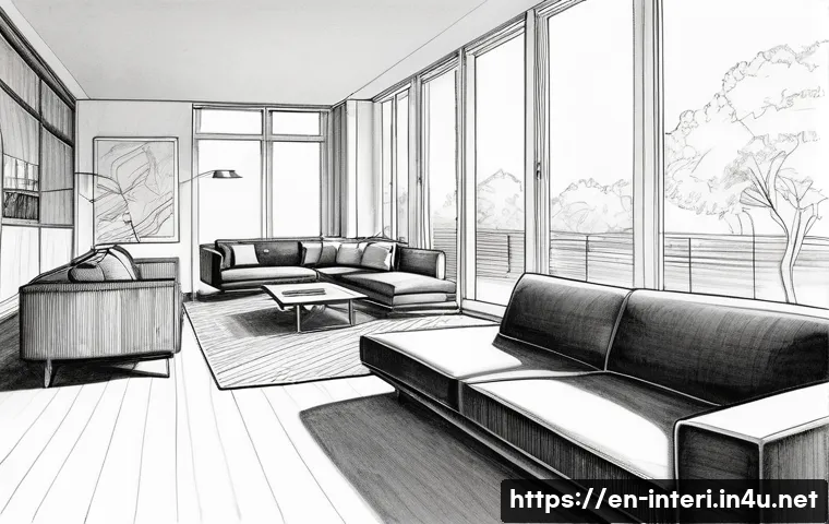
Mastering sketching techniques is essential for anyone diving into interior architecture. It’s not just about putting lines on paper; it’s about capturing the essence of a space, its mood, and functionality in a way that communicates your vision clearly.
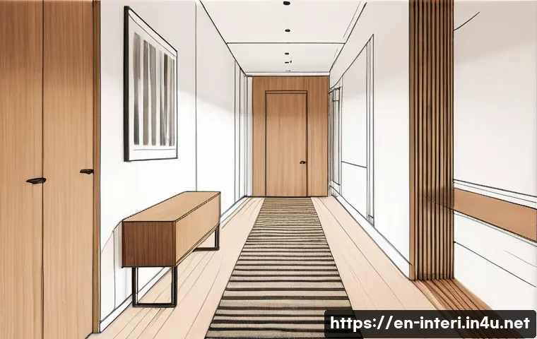
Whether you’re a beginner or refining your skills, understanding the nuances of perspective, shading, and texture can transform your designs. Over time, these skills become a powerful tool to bring ideas to life quickly and effectively.
Let’s explore the key sketching techniques that can elevate your interior design projects and set you apart in this creative field. I’ll make sure you get a clear and practical guide to boost your sketching confidence!
Unlocking the Power of Perspective in Interior Sketches
Grasping One-Point and Two-Point Perspectives
When I first started sketching interiors, nailing perspective was the hardest part. One-point perspective draws the viewer’s eye straight into the depth of the room, perfect for capturing hallways or rooms viewed head-on.
Two-point perspective, on the other hand, adds that realistic angularity, making corners and multiple walls come alive. I remember sketching a simple living room and realizing how much depth two-point perspective added compared to flat drawings.
Mastering these allows you to create believable spaces that don’t just look like flat plans but feel immersive.
Using Horizon Lines and Vanishing Points Effectively
Setting your horizon line correctly is a game-changer. It determines your eye level and helps keep proportions consistent throughout your sketch. For interiors, placing the horizon line a bit lower than usual gives a more grounded feel, mimicking how people naturally see rooms.
Vanishing points, where all your lines converge, can be tricky but once you get the hang of placing them logically—usually outside the room’s borders—you’ll notice how your sketches suddenly pop with realism.
It’s like creating a window into the space rather than just a drawing on paper.
Common Perspective Pitfalls and How to Avoid Them
I’ve lost count of how many sketches I’ve had to scrap because the angles looked “off.” A common mistake is overcrowding the sketch with too many vanishing points or misplacing them, which distorts the spatial flow.
Another trap is ignoring vertical lines, causing walls to lean awkwardly. A quick tip: use light construction lines as a guide and always double-check angles before adding details.
Trust me, a few minutes of prepping perspective lines saves hours of frustration later.
Breathing Life into Sketches with Shading and Light
Choosing the Right Shading Techniques for Different Materials
Shading is where your sketch starts to tell a story about texture and materiality. For instance, when I wanted to depict a plush velvet sofa, I used smooth, subtle cross-hatching to suggest softness, whereas for a wooden surface, I went with directional strokes that mimic grain.
Experimenting with shading methods like stippling, hatching, or blending can really highlight the contrast between hard and soft surfaces, giving your drawing depth and character.
Capturing Natural and Artificial Lighting Effects
Lighting completely changes how a space feels, and your sketches should reflect that. When sketching a room with large windows, I like to exaggerate the shadows cast by sunlight streaming in, using sharp contrasts between light and dark areas.
For artificial lighting, softer gradients and more diffused shadows work better. This attention to light sources not only helps viewers understand the time of day or mood but also adds a realistic dimensionality to your design.
Using Highlights to Emphasize Key Features
Adding highlights can be subtle yet incredibly effective. When I sketch metallic fixtures or glossy surfaces, a small white highlight or a brighter spot can simulate reflection, making elements stand out.
This technique is especially useful for drawing attention to focal points like a statement chandelier or a sleek countertop. The key is to balance highlights so they don’t overpower the sketch but instead complement the overall composition.
Mastering Line Quality and Texture Representation
Varying Line Weight for Depth and Focus
One trick I’ve found invaluable is playing with line thickness. Thicker lines can bring objects to the foreground, while thinner lines recede into the background, creating a natural sense of depth.
For example, when sketching a room’s layout, I outline the main furniture pieces with bold strokes but use lighter lines for floor textures or distant walls.
This contrast guides the viewer’s eye and prevents the sketch from looking flat or cluttered.
Imitating Different Textures with Simple Strokes
Texture is what makes a sketch tactile. Wood, fabric, glass, and stone all have unique characteristics that you can hint at with specific stroke patterns.
For rough stone walls, I use short, jagged lines; for smooth glass surfaces, I keep strokes minimal and clean. Over time, developing a “texture library” in your sketchbook by practicing these strokes can be a huge time saver during fast conceptual sketches.
Maintaining Clean and Intentional Sketch Lines
Messy sketches can be confusing, especially when presenting ideas to clients or collaborators. I always advise using deliberate strokes and erasing unnecessary guidelines once the main forms are established.
It’s tempting to keep every exploratory line, but clarity is king in interior architecture. A clean sketch not only looks professional but also communicates your vision more effectively, which is crucial when you want your ideas to be understood instantly.
Efficient Use of Color to Enhance Interior Concepts
Choosing a Simple Palette for Quick Conceptual Sketches
When time is tight, I stick to a minimal color palette—usually just two or three hues. This approach keeps the sketch from becoming overwhelming and allows key features to pop.
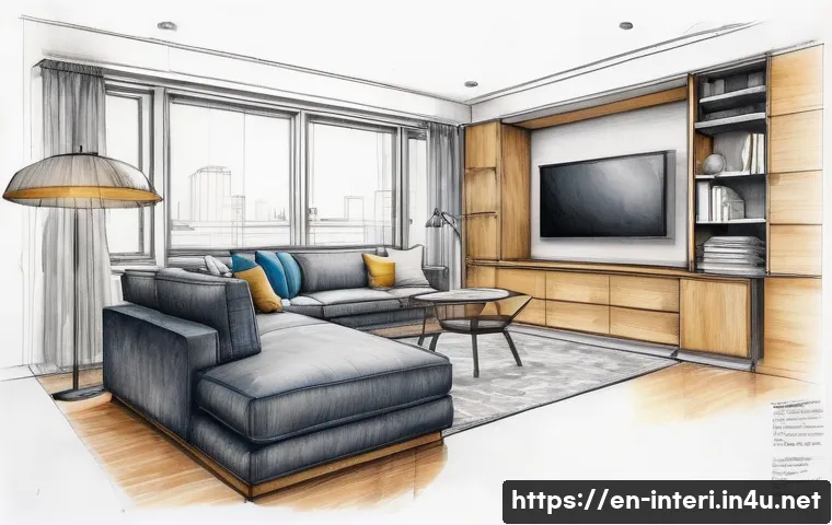
For example, using muted earth tones for the background with a vibrant accent color on furniture pieces can quickly communicate the mood without needing full rendering.
Keeping colors consistent across projects also helps build your unique visual style.
Watercolor Washes vs. Colored Pencils: Pros and Cons
I’ve experimented with both watercolor and colored pencils for interior sketches, and each has its perks. Watercolors give a loose, fluid feel that’s great for capturing ambiance and light reflections.
However, they require more drying time and control. Colored pencils, on the other hand, offer precision and layering ability, perfect for detailed textures and sharp edges.
Choosing between them depends on your project needs and personal workflow.
Balancing Color with Linework for Maximum Impact
Color shouldn’t overpower your sketch but rather support the structure and mood. I always apply color after finalizing linework to avoid muddying details.
A good strategy is to use color sparingly—highlighting key zones like upholstery, flooring, or wall finishes—while leaving other areas monochrome. This selective coloring directs attention and makes your sketches more dynamic and easier to interpret.
Organizing Your Sketching Process for Consistency and Speed
Creating a Pre-Sketch Checklist
Before putting pencil to paper, I run through a quick checklist: defining the room’s function, deciding the viewpoint, establishing light sources, and choosing materials to highlight.
This prep work saves a ton of time and prevents mid-sketch confusion. Having a routine like this makes your workflow smoother and your final sketches more coherent.
Layering Your Sketch: From Rough Outlines to Detailed Rendering
I always start with loose, light outlines to block in the space and major elements. This initial layer is forgiving and allows for adjustments. Once satisfied, I build up details, add textures, shading, and finally color.
Working in layers not only improves accuracy but also helps keep the sketch clean and manageable.
Time-Saving Tips for On-the-Go Sketching
There have been many occasions when I needed to sketch quickly—client meetings, site visits, or brainstorming sessions. Carrying a small sketchbook and a few pencils with different hardness grades is essential.
I rely on shorthand symbols and simplified textures to capture ideas fast, knowing I’ll refine them later. Using tools like a portable ruler or template can also speed up drawing straight lines or repeating shapes.
Comparing Sketching Tools for Interior Architecture
Graphite Pencils, Pens, and Markers: When to Use Each
Choosing the right tool depends on your style and the sketch’s purpose. Graphite pencils offer versatility in shading and erasing, perfect for early-stage concepts.
Fine liners or technical pens provide crisp lines ideal for presentations. Markers can quickly add bold color areas but are less forgiving. I personally combine these tools depending on the phase of my work to balance flexibility and precision.
Digital vs. Traditional Sketching: Pros and Cons
Digital sketching tablets like iPads with Apple Pencil bring incredible convenience—undo options, layers, and easy color adjustments. However, I find traditional sketching offers a tactile connection to the space that’s hard to replicate digitally.
The feel of pencil on paper helps me think spatially and intuitively. Both methods have their place, and blending them can lead to the best results.
Maintenance and Care for Your Sketching Tools
Keeping your tools in good shape is often overlooked but crucial. I sharpen pencils regularly to maintain fine points, clean pen nibs to avoid blotches, and store markers capped tightly to prevent drying out.
A well-maintained toolkit ensures your sketches stay sharp and professional-looking every time you sit down to draw.
| Tool | Best For | Advantages | Limitations |
|---|---|---|---|
| Graphite Pencils | Shading, detailed sketches | Flexible shading, erasable | Smudges easily, less bold lines |
| Technical Pens | Line work, presentations | Crisp, consistent lines | Not erasable, limited shading |
| Markers | Quick color fills | Bold, vibrant colors | Less control, permanent |
| Digital Tablets | All-in-one sketching and coloring | Undo, layering, portability | Requires learning curve, screen feel |
Using Annotations and Callouts to Clarify Design Intent
Strategically Placing Notes Without Cluttering
Adding notes to your sketches can be a lifesaver for communicating ideas, especially when sharing with clients or contractors. I’ve learned that placing annotations neatly around the sketch’s periphery keeps the drawing clean and readable.
Using arrows and lines to connect notes to specific features helps avoid confusion. It’s a balancing act: too many notes can overwhelm, too few can leave your design open to misinterpretation.
Highlighting Functional Elements Through Callouts
Callouts are perfect for emphasizing functional details like lighting types, material finishes, or furniture specs. I like to use simple geometric shapes or boxes with clear labels to make these stand out.
This not only adds professionalism to your presentation but also guides viewers through the thought process behind your design choices, making your sketches more persuasive.
Incorporating Measurements and Scale Indicators
Including rough dimensions or scale references is a subtle but powerful tool. It grounds your sketch in reality and helps others visualize actual sizes.
I often add a human figure or furniture piece as a scale reference, which instantly gives context. Even approximate measurements can prevent misunderstandings during construction or client review stages.
This small detail shows your attention to practical feasibility alongside creativity.
Conclusion
Mastering perspective and sketching techniques is key to bringing interior spaces to life on paper. By understanding light, texture, and line quality, your sketches become more than just drawings—they tell a story. With practice and the right tools, you can confidently communicate your design vision with clarity and impact. Keep experimenting, and watch your skills transform your ideas into immersive visual experiences.
Useful Tips to Remember
1. Always start your sketch by defining the viewpoint and horizon line to establish a strong foundation for perspective accuracy.
2. Use varied line weights to create depth and focus, making important elements stand out naturally.
3. Incorporate shading and highlights thoughtfully to convey different materials and lighting conditions effectively.
4. Keep your color palette simple for quick conceptual sketches, using color strategically to emphasize key features.
5. Maintain clean sketches by layering from rough outlines to detailed rendering and removing unnecessary construction lines.
Key Takeaways
Understanding and applying perspective correctly is essential to creating believable interior sketches that engage viewers. Balancing line quality, shading, and color enhances the tactile and emotional qualities of your drawings. Organizing your process and choosing the right tools improve both speed and consistency. Lastly, clear annotations and scale references strengthen communication, making your sketches practical and professional. These principles combined elevate your interior sketching from basic drafts to compelling design narratives.
Frequently Asked Questions (FAQ) 📖
Q: How can I improve my perspective drawing skills for interior sketches?
A: Improving perspective in interior sketches starts with understanding the basics—one-point, two-point, and three-point perspectives. I found that practicing simple shapes like cubes and rectangles in different perspectives helped me grasp spatial relationships better.
Using horizon lines and vanishing points consistently guides your lines accurately, making your sketches look more realistic. Also, don’t hesitate to use light construction lines; they’re your best friend in maintaining proportions.
Over time, combining these fundamentals with quick, repetitive sketching sessions can dramatically boost your confidence and precision.
Q: What are the best shading techniques to make interior sketches more dynamic?
A: Shading is where your sketches start to feel alive. From my experience, using a combination of hatching, cross-hatching, and blending can add depth and texture to your drawings.
Start by identifying your light source and imagine how shadows fall on surfaces—this creates a mood and highlights functionality. I often use softer pencils (like 2B or 4B) for darker areas and harder pencils (like HB) for lighter shading.
Don’t be afraid to layer your shading gradually; it gives you more control and makes the sketch look polished without overdoing it. The key is to keep it loose enough to retain the sketch’s energy but detailed enough to communicate materials and space.
Q: How can texture be effectively represented in interior sketches without overcomplicating the drawing?
A: Texture adds character and realism, but it’s easy to get carried away. I learned that suggesting texture rather than fully rendering it works best, especially in quick sketches.
For example, simple patterns like dots, short lines, or scribbles can hint at fabrics, wood grain, or tiles without cluttering the drawing. The trick is to focus on key surfaces that define the space’s feel—like a cozy sofa fabric or a sleek countertop—while keeping other areas minimal.
This selective detailing guides the viewer’s eye and keeps your sketch readable. Trust your intuition; sometimes less is more when conveying texture in interior design sketches.